
No one should have to suffer through a boring online Powerpoint presentation again.
And yet, a major complaint to have emerged in 2020, the year of multiple lockdowns worldwide, is that “death by deck” is an everyday reality.
A statement from fashion retailer Next, described that employees working from home suffered from “slideshow presentations that transform meetings from productive exchanges of ideas into boring, one-way lectures; with the “presenters” rattling through bullet points already visible to their stultified audience”.
What if your company could learn to deliver engaging and useful presentations?
I’ve made it my personal mission to help as many companies as possible to put a stop to boring presentations.
Here are some of the common mistakes made by companies and how to avoid them:
Mistake #1: Reading what’s on the slide
A common approach for presenters to take is to write their script, copy and paste it into slides, and then use the slides as a fancy teleprompter. Job done, right?
False. This approach makes you, the presenter, completely unnecessary. You are not adding anything to the slides, or helping them find their way through the information shared.
In fact, your audience is more likely to be able to understand your content by reading it in their own time than sitting through your presentation.
But they are sitting through your presentation, so how can you switch things up to be more engaging?
Alternative: One great rule to live by is “one point = one slide”.
If you want your audience to take in information, then you need less content and more slides. This is not the time nor the place to delve into the minutiae of every footnote of a report.
Keep each slide light on the text, and choose instead an image with a big visual impact.
Here’s an illustration of what I mean:
 The slide on the right has a lot of great information and more context, but the temptation for the speaker is going to be to read it all.
The slide on the left on the other hand has pared the information down to just one key quote and an image that suggests that there’s a story waiting to be told by the presenter.
Mistake #2: Talking at your virtual audience
Unlike a face-to-face presentation, it’s easy to forget that your audience is there. After all, they’ve all muted themselves, and you’ve switched your view to your slides, so you might be tempted to power through without checking on them.
Believe me, if you do that, they’ll notice and quickly tune off.
Alternative: work your audience into your presentation plan.
For example, you could ask for your audience’s input during the presentation. If your audience is a decent size, you could use the poll function of your conference call software, or use an outside audience engagement tool like Mentimeter. This is also great at breaking up the presentation which, as we will see in next point, is important! Use the names of members of the audience where you know them.
Mistake #3: Your presentation is too long
It’s no secret that attention spans online are shorter and harder to hold. Instead of dealing with one audience, you are presenting to an audience of individuals each with their own home distractions.
It’s said that a regular audience’s attention span is 7-10 minutes. You can halve that with an online presentation.
Alternative:
- Be upfront about the timings with your audience from the start
- Include short coffee breaks in your presentation
- Switch up the presentation with games and polls
Mistake #4: Your voice puts the audience to sleep
Whilst body language is crucial in face-to-face presentations, voice does the heavy lifting online.
Do you know how to use it to keep your audience engaged? Or are you sticking to a monotone throughout?
Alternative: Read my blog post on how to develop an effective voice for your online presentation. The key, as you’ll see, is variety!
Mistake #5: You really really love transitions
Flashy transitions and animations in each slide might be fun but too many and your audience won’t know what to focus on.
Alternative: Less is more. If you want to impress do it with a great image or video, and a strong presentation. You don’t need the crutch of eccentric transitions to keep your audience interested!
Mistake #6: One of your audience members is un-muted
We’ve all been in online presentations where the audience hasn’t been automatically muted, and an unaware participant accidentally becomes a presenter.
It causes delays, flusters the presenter, and interrupts the flow of the presentation. All around: not a great look!
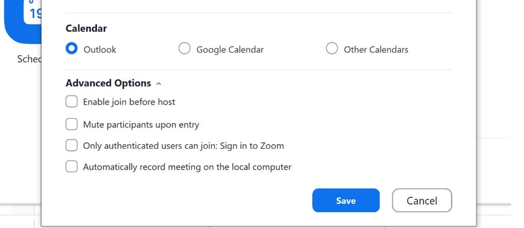
The alternative: get to know your software! Most video conferencing tools give you the option during the set up to choose whether your audience will be muted or not. In Zoom for example, if you’re setting up a standard meeting rather than a webinar, you can find this option during set up under “Advanced options” -> “Mute participants upon entry”. You can always un-mute them manually at the end for some Q&As or a round of applause!
 Mistake #7: Your presentation doesn’t hold together
 Mistake #7: Your presentation doesn’t hold together
What might feel like a cohesive presentation in your head can be hard to follow for your audience. If they’re spending their energy trying to understand why you’ve leapt from point A to point J, they’re not going to be taking in your content.
Alternative:
- check the order of your slides – does each one relate to the one it comes after?
- take a bird’s eye view of your slides: as a whole, are they telling the story you want? Are there any obvious gaps?
Mistake #8: Your video isn’t working
Videos can be a great asset to a presentation but also the biggest source of disappointment when they go wrong. You don’t want to get to that slide, press play and find that either a) the video isn’t playing or b) it’s taking ages to buffer. Your broadband, which is already struggling to let you present to a virtual audience, cannot cope with the YouTube hosted video.
Alternative: put luck on your side by downloading the video and inserting it into your Powerpoint (rather than choosing the URL option). As you give your presentation a few tech runs, check that it’s working correctly (and is the right version of the video of course!).
Mistake #9: Your slides don’t fit the screen
We’ve all sat through presentations where the slides are oddly cut off with chunks of text missing off screen. It happens to the best of us, if you are based in the UK you might have recently seen this during the BBC news segment prior to Boris Johnson’s lockdown announcement.
 This is often a problem when converting slides from one system to another, from Powerpoint to Keynote or Google Slides for example.
Alternative: Of course, an easy way to solve this issue is to follow point #1 and drastically eradicate text from your slide. If, however, the text is absolutely necessary to your presentation, then your best option is to check and re-check that the text fits when you view the slides in presentation mode on the screen they’ll be displayed on. If you want to be sure, test run your presentation with a colleague.
The Ultimate Mistake: Not Practising
Most of the above mistakes can be easily avoided by running through your material both from a content and a technical point of view.
And of course, remembering who your presentation is for: audience, audience, and audience!